Google says your site isn’t mobile friendly?
With Google placing a greater emphasis on mobile compatibility in search placement, many businesses are in a panic over how to make their websites mobile friendly. What does that even mean? How do we get there from here? Should we do just the minimum or is now the time for a broader site re-design?
Being mobile friendly used to mean having a separate website just for mobile and making your site smart enough to redirect the user to this .mobi or other mobile site when detecting their device type or screen size. Today, mobile friendly more often means having one site that is “responsive” to detected screen sizes and device types so that it presents the same content in the manner best suited to the user’s screen size and interface method (mouse and keyboard v. touch being the prime example). Through the power of Cascading Stylesheets, it isn’t too difficult to make a site responsive. However, a little extra work goes a long ways in making the site truly usable for differing screen sizes and device types.
Is your site mobile friendly now? Google offers the Mobile-Friendly Test tool to test whether your site is mobile friendly.
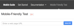
This tool could tell you your site uses too small a font, has links too close together for touch screen use, is too wide for smartphones and tablets, doesn’t have a mobile profile or doesn’t work well for mobile in various other ways.
There are many ways to make a site more mobile friendly. For sites on content management systems like WordPress or Drupal and sites built with popular site builders like Wix, Squarespace or Weebly, the simple solution may be switch your theme or template to one that takes care of mobile for you. If your site, current theme, widgets, plug-ins, etc. are very straight-forward, this can be a very simple project that mainly requires just fixing up the branding elements within the new template (header, logo, colors & fonts, etc.) for brand consistency.
More complex sites will require additional work to adjust, fix or replace elements that don’t work well with a mobile friendly theme or on mobile devices. For example, custom page templates in WordPress may be forced to work on mobile because of how they are wrapped in the theme but that doesn’t mean they will look good or be usable. Testing is important.
Most of your testing can be done from any computer. Simply re-sizing the browser window to narrower dimensions will show what will happen for tablets and smartphones. However there are other important things to test. Google’s tool is a handy way to test the most common usability issues. Does your site use Adobe Flash? That can be an obstacle to Apple iOS device users since Apple has avoided Flash support on iOS. It might be time to consider moving to HMTL5 for animation and effects.
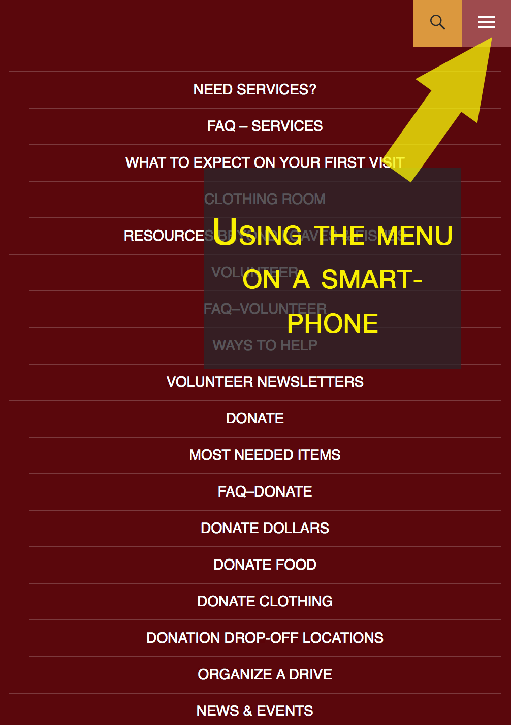
We’ve been helping clients like Loaves & Fishes Food Pantry in Devens, MA, update for mobile friendliness. In Loaves & Fishes’ case, mobile was among several enhancements planned for this year before Google made mobile an imperative.
Below you can see the site at normal browser size, tablet size and smartphone size. Click any image for a larger version.
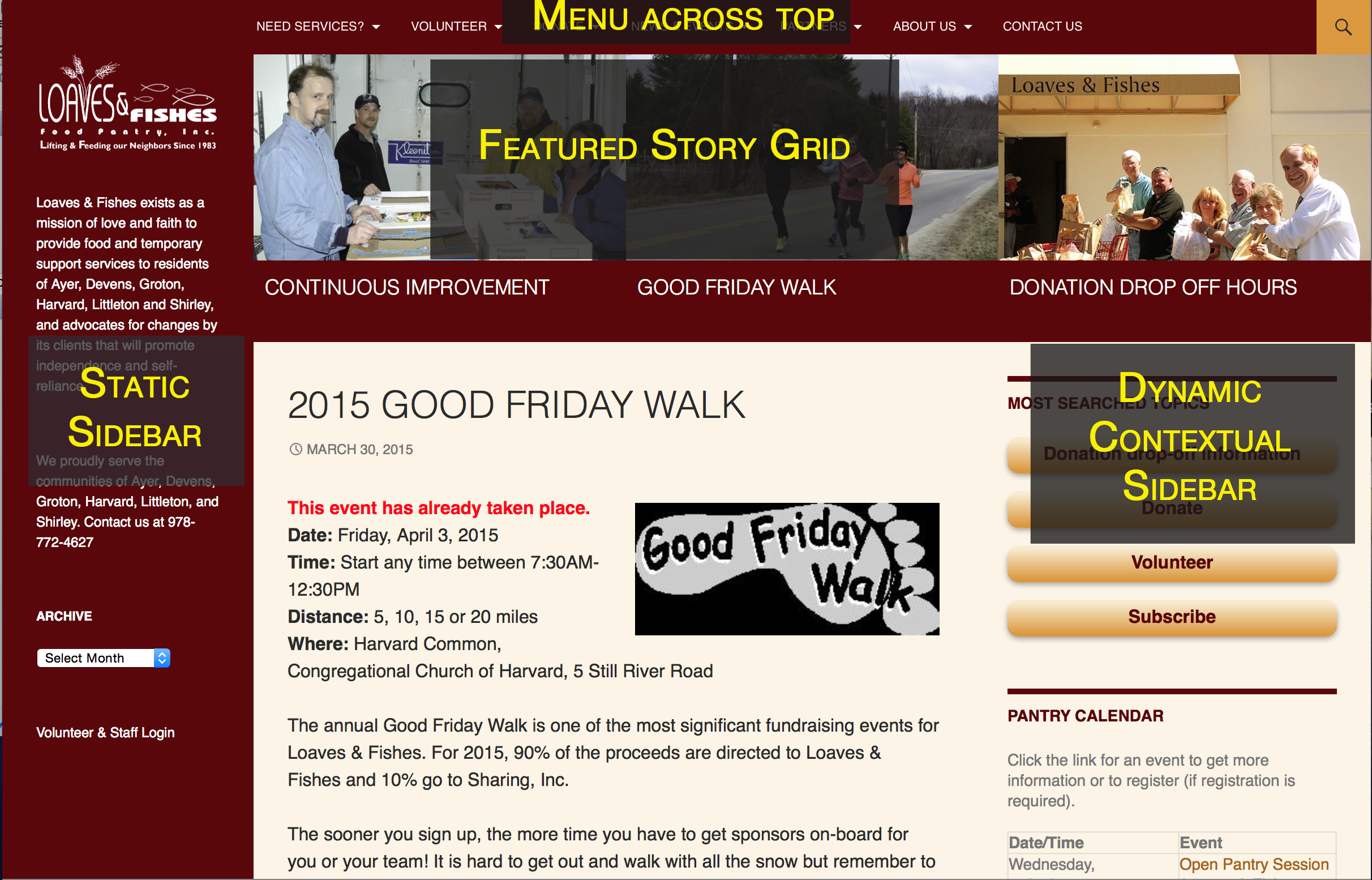
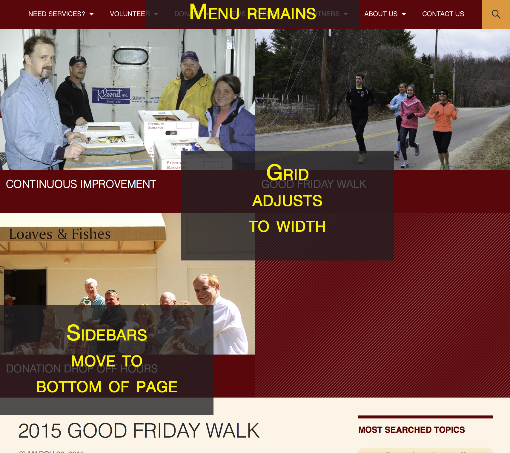

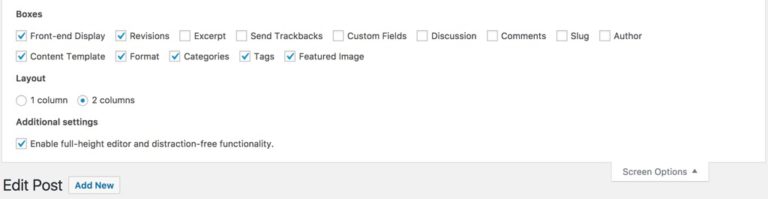
The Loaves & Fishes site update uses WordPress with a customized child theme based on the Twenty Fourteen theme. Minimal plugins are used for the multiple sidebars, an event management system for their calendar, enhanced security and social media share / follow options.