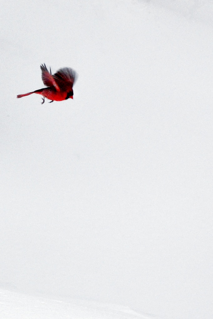
Less is more, a cliche that never gets old

When I edited this photo, my task was to take away, not add to the image. It was surrounded by other birds, trees and branches, a bird feeder and the snow’s color didn’t capture well. Cropping solved most of the challenge. A little Perfect Photo Suite eraser and some white balance adjustments, a little more detail for the bird and a lot less for the background. To me, it says more by having less distraction. Does your marketing say what it is supposed to say without distracting? Do you engage your audience or drown them in detail before they’ve chosen to engage with your brand / product / service?

